Background
Our organization is launching a desktop and mobile web application designed to revamp internal communication and collaboration. This all-in-one platform integrates a message board, dashboard, and social feed, with the goal of fostering improved engagement, connectivity, and productivity among our employees. We aim to provide an accessible and user-friendly tool that empowers our diverse workforce to communicate, share knowledge, and stay informed, whether they're at their desks or on the go.
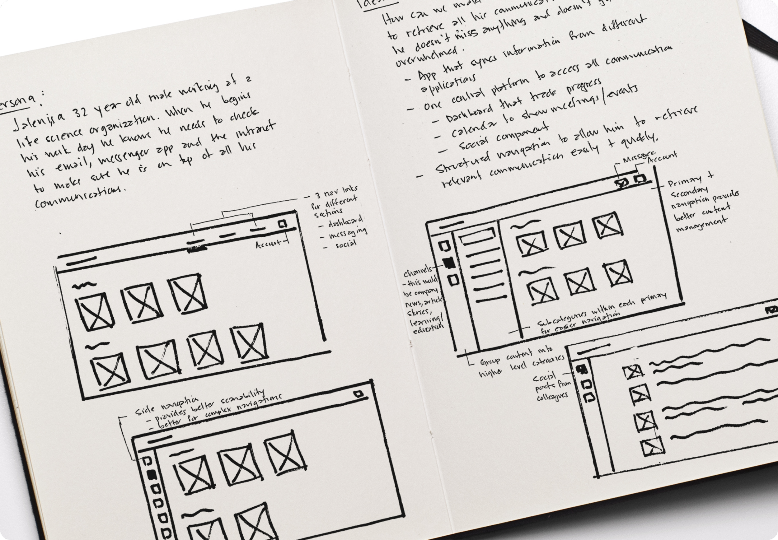
User Research
During the user research phase, our team engaged in in-depth interviews with a diverse group of users, which unveiled a common and critical pain point in their daily work routine: a sense of being overwhelmed by the lack of organization in their messages and communications.
As this platform aims to consolidate and streamline communication from various sources into one unified application, the significance of tackling this issue became evident. Users expressed their desire for an organized and efficient system that would ensure they could easily access and manage the information they needed. This pain point underscored the importance of designing a solution that would not only enhance communication but also alleviate the stress associated with information overload, ultimately leading to a more productive and user-friendly experience.
Ideation + Wireframes
During the ideation and wireframes phase, we focused on addressing the user's core need for organized communications to prevent feeling overwhelmed. Building on this user need statement, we developed a set of solutions to tackle this issue effectively. These solutions included:
Grouping communications into different categories such as "new," "urgent," and "action items."
Allowing users to apply various message management actions, including marking messages with stars, archiving/hiding, deleting, saving for later, and moving to folders.
Providing users with the flexibility to change their message views, offering options like card view and list view.
Introducing a left-sided menu for organizing communications into categories, creating a familiar and user-friendly navigation structure.
Enabling users to prioritize messages from specific senders, departments, or content types.
Based on user familiarity and minimal friction, we decided to proceed with low-fidelity wireframes that incorporate a left-sided menu for organizing communications. This approach aligns with designs that our users have previously used, ensuring a seamless transition and a more user-centric solution to their communication organization challenges.
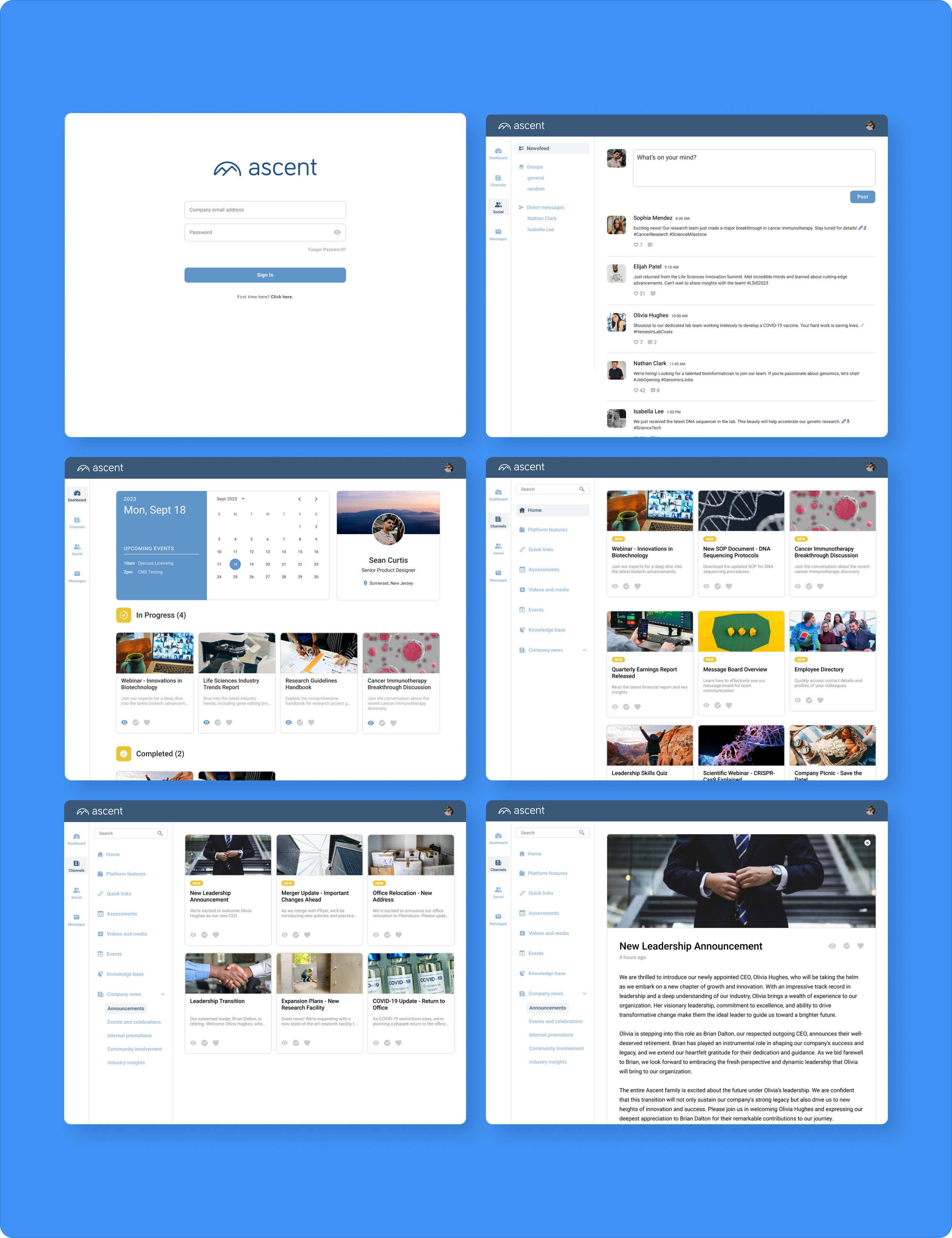
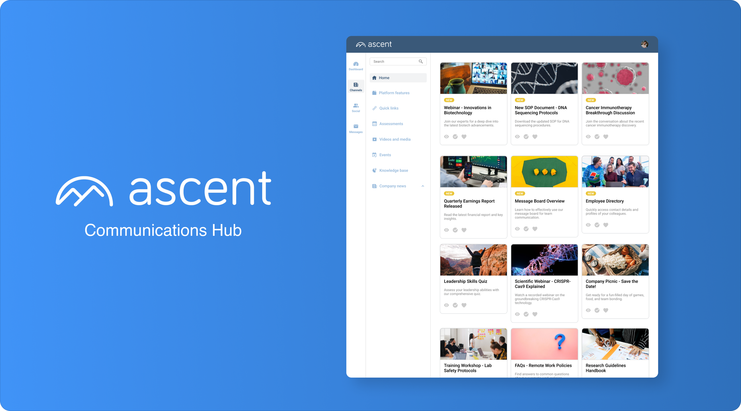
Final Designs
The final high-fidelity designs offer a user-centered solution that squarely addresses the need for organized communications. Leveraging a left-sided menu, a familiar and intuitive choice for our users, these designs allow for message prioritization based on senders, departments, or content types. Users can also apply actions like starring, archiving, deleting, saving for later, and moving messages to folders, promoting ease of access and control. Emphasizing a card view, we chose a clean and visually engaging design, maintaining a focus on reducing the feeling of being overwhelmed and ensuring efficient, personalized communication within the platform.